
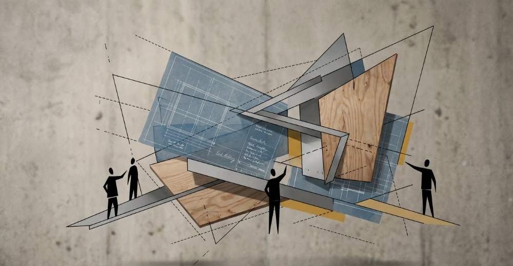
Mark Excell is a designer and UX practitioner with over twenty years of experience across brand identity, digital design, print and user experience. The work ranges from full brand identity systems through to complex web interfaces, and the approach across all of it is the same: understand the audience properly, involve the client genuinely, and make decisions that can be explained and defended rather than ones that simply look good in a presentation.
Explore my work
User experience design is concerned with how a product works and how people move through it. At its foundation it is a research discipline. Understanding who the users are, what they are trying to achieve, where they get confused and what would make the experience genuinely useful, all of that work happens before any visual design decisions are made. The output of good UX work is not a beautiful interface. It is a clear, justified rationale for every structural and navigational decision in the product, expressed first as wireframes and then as tested prototypes.


User interface design is where the UX rationale becomes visible. Typography, colour, spacing, component hierarchy, interaction states and visual consistency across a product are all UI concerns. Good UI design is not decoration applied to a finished structure. It is a system of decisions that makes the UX rationale legible and trustworthy to the people using it. A well-designed interface feels obvious in use, which is the highest compliment it can receive and the hardest thing to achieve.
Graphic design in a digital context sits across brand identity, print production, marketing materials and the visual language of digital products. The print production background that predates the digital work informs this: understanding how colour behaves in CMYK, how type sits on a physical page, and how large format output demands a different kind of thinking to screen design. That physical grounding produces digital graphic work that tends to be more considered and more durable than work produced entirely within a screen context.

The three disciplines are presented separately here because they have distinct concerns, tools and outputs. In practice they overlap constantly. A brand identity project involves graphic design, typographic decisions that feed directly into UI, and an understanding of the user context that is pure UX thinking. Treating them as genuinely connected rather than separate specialisms is what makes the work coherent rather than merely competent.
The process draws deliberately on two complementary methodologies. The Google UX Design framework contributes technical rigour, particularly around prototyping, usability testing and design systems thinking. The CalArts approach to UX contributes a more comprehensive grounding in user psychology, empathy mapping and the broader human context that shapes how people experience designed things. Neither methodology is followed exclusively because neither is complete on its own. The strongest parts of both are combined into a process that is practical enough to use on real projects with real clients and real timescales.
Most clients arrive with a solution rather than a problem. They want a new website, a rebrand, an app, a brochure. The brief building phase works backwards from that to understand what they are actually trying to achieve, who they are trying to reach, and what success looks like in measurable terms. This is not a bureaucratic exercise. It is the most valuable conversation in the entire project, because a brief that is properly understood produces work that actually solves the right problem. Clients who have been through this process properly tend to remark that it was more useful than they expected.
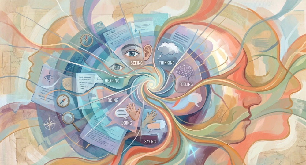
Understanding the end user as thoroughly as the client is a non-negotiable part of the process. User research, empathy mapping and journey mapping establish who the audience actually is rather than who the client imagines them to be. These two things are often different, and the gap between them is where most design projects run into trouble. The CalArts methodology is particularly strong at this stage, bringing a depth of user psychology and behavioural thinking that the more technically oriented frameworks tend to treat lightly.
Low fidelity wireframes establish the information architecture and user journey before any visual design decisions complicate the conversation. At this stage the question is purely structural: what needs to be on each page, in what order, connected in what way. Figma is the tool of choice here, moving quickly from rough layout sketches to interactive prototypes that can be tested with real users before a single colour or typeface decision is made. The prototyping discipline from the Google UX framework is applied rigorously at this stage, testing assumptions before committing to them.

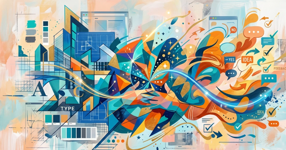
High fidelity visual design is developed in Figma and presented to the client in stages rather than as a finished artefact. This is a deliberate choice. Clients who see their project evolve through visible iterations, who contribute feedback at meaningful points and see that feedback incorporated, develop a genuine sense of ownership over the outcome. They understand why the design looks the way it does because they were part of the reasoning. That buy-in is not a soft benefit. It produces better briefs for subsequent rounds, faster sign-off, and a client who can confidently explain and defend the design to their own stakeholders.
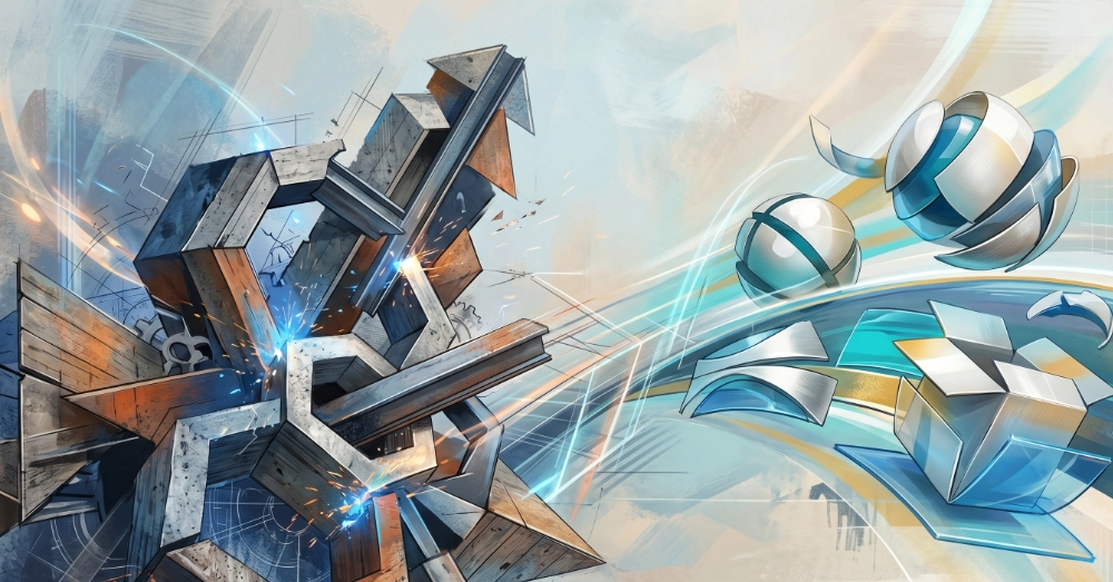
The design is brought to life with the same level of attention as the design process itself. Technical constraints are considered from the start of the project rather than discovered during the build phase, which is where many design and development collaborations break down. Having the design and development capability in the same hands means the gap between what was designed and what gets built is as small as possible. What the client signed off is what goes live.
The most direct evidence of design thinking is a designed thing, with the reasoning behind it made visible. This site was designed from the ground up as a complete design exercise: brand strategy, visual identity, colour system, typographic hierarchy, component logic and accessibility decisions all documented here as they were made. What follows is that documentation.
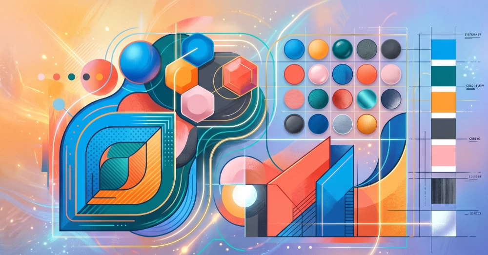
The colour palette was built around a primary teal (Teal Dark #2F6364) chosen for its professional composure and its distance from the generic blues that dominate the digital agency and portfolio space. A mid teal (#3D7F80) for hover and secondary states, and a light teal (#E8F2F2) for section backgrounds and card fills, give the primary colour a complete tonal range without introducing additional hues.A warm accent, Ember (#C4622D) and its light companion (#F2E8E1), provides the contrast needed for calls to action and highlighted content without the aggression of a red. The combination of cool teal and warm ember is a deliberately unusual pairing that feels considered rather than accidental.The neutral range runs from Near Black (#1A1A1A) through Dark Grey (#4A4A4A), Mid Grey (#8A8A8A) and Off White (#F4F4F2) to White (#FFFFFF). Each value in the range has a specific role: Near Black for headings, Dark Grey for body copy, Mid Grey for captions and metadata, Off White for section backgrounds, White for card surfaces and the navigation bar. The roles are defined and adhered to consistently across the site rather than applied intuitively.
Two typefaces are used. Playfair Display is the display font, used for headings and the logo wordmark. It brings warmth, personality and a sense of craft to what could otherwise be a purely functional layout. DM Sans is the body font, used for all running text, labels, navigation and UI elements. It is clean, legible at small sizes and has enough personality to complement Playfair Display without competing with it.The typographic hierarchy is defined by role rather than by size alone. The H1 is set large and in Playfair Display. H2 headings use Playfair Display at a smaller size. H3 headings drop to a medium weight DM Sans, signalling a shift from structural headings to content headings. Body text is DM Sans at 16px with a line height of 1.7, which is slightly generous but appropriate for longer reads. Section labels use DM Sans at 11px in uppercase with letter spacing, a convention borrowed from editorial design where it signals metadata rather than content.
The component system is built on FlowUI Lite, a free Webflow component library, with brand colours and typography applied consistently across all component variants. The decision to use FlowUI rather than building components from scratch reflects a deliberate approach: established component patterns handle accessibility and interaction states correctly out of the box, which frees the design work to focus on the visual and content decisions that actually differentiate the site rather than reinventing structural patterns that are already well-solved.Each component category used on the site has a consistent mapping to the brand colour system. White card surfaces on Off White section backgrounds for primary content. Teal Light backgrounds for skill tags and category labels. Ember and Ember Light for testimonials and featured work. Teal Dark for the footer, CTA bands and primary buttons. The consistency is visible across pages without being mechanical.
Colour contrast across the site meets WCAG AA standards throughout. The Near Black on White pairing used for primary text has a contrast ratio well above the 4.5:1 minimum. The Teal Dark on White pairing used for links and buttons meets the standard for large text and interactive elements. The Teal Dark on Teal Light pairing used for category tags was checked specifically as a lower contrast combination and confirmed compliant.All interactive elements use semantic HTML elements, buttons for actions, anchor tags for navigation, with appropriate aria labels on icon-only elements. The navigation includes a skip to main content link for keyboard users. Images include descriptive alt text throughout.
The following projects illustrate the range of design work across digital, print and UX consultancy contexts.
Digital design and web
The Recycler is an international technology and imaging supplies publication with a global audience across print and digital. The initial brief was to reproduce the legacy site faithfully in WordPress, preserving the existing information architecture and content structure that the readership was accustomed to. Once that foundation was stable, the second phase brought the site up to date visually, modernising the design language while maintaining the editorial character the publication had built over many years. The challenge on an established publication with an international audience is that visual change carries risk. The approach was conservative where the audience expected familiarity and deliberate where modernisation served the readership rather than the design portfolio.
UX consultancy and development
The Low Carbon Dorset project involved two distinct phases. The first was a consultancy role working alongside the project designer, providing technical guidance on what was achievable within the platform and build constraints so that the design vision was grounded in what could actually be delivered. This kind of early technical input into a design process prevents the disappointment of a design that cannot be built as intended, and it is a role that benefits from having both design and development knowledge in the same conversation. The second phase was the build itself, bringing the signed-off design to life in WordPress. Unusually for a public sector project of this kind, the end client, Dorset County Council, provided direct feedback during the build phase rather than working exclusively through the agency. That direct relationship produced faster, more specific feedback and a better end result.
This site
The design of markexcell.co.uk is documented in full in the live demonstration section above. The short version is that every visual decision on this site was made deliberately, documented at the time, and is explainable in terms of the brief it was responding to. The brief was to build a practitioner showcase that felt professional and human simultaneously, that evidenced design capability through its own construction, and that could evolve as the practitioner's circumstances change without requiring a structural rebuild. The design system achieves all three.
The following tools cover the full design workflow from initial research and wireframing through to visual design, print production and delivery.
Figma, wireframing, low fidelity sketching, interactive prototyping, user journey mapping, empathy mapping, usability testing
Affinity Suite version 2 (Affinity Designer, Affinity Photo, Affinity Publisher), Adobe Creative Cloud (Photoshop, Illustrator, InDesign), professional colour profiling, large and small format print production
Figma component systems, Webflow, design tokens, responsive design, WCAG accessibility standards
Google UX Design methodology, CalArts UX principles, empathy mapping, user persona development, information architecture, content strategy
These questions and answers are present in the structured data on this page. The FAQPage schema in the JSON-LD means AI engines can extract and cite these answers directly.